My client for this project, Guru Experience, was setting up an augmented reality element for a museum client of theirs. They requested some animated models for use in Unity: a sheet of parchment on which the words of a poem would appear and a quill pen that would move along the text as if writing. The writing would need to match up with a sound clip of the poem being read aloud.
The poem text and the sound clip were provided by Guru.
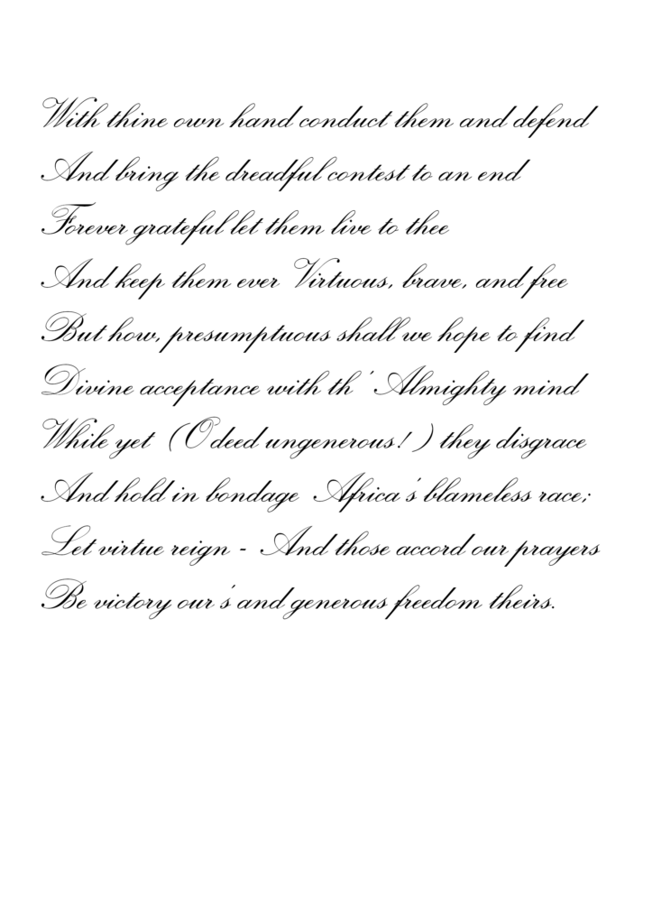
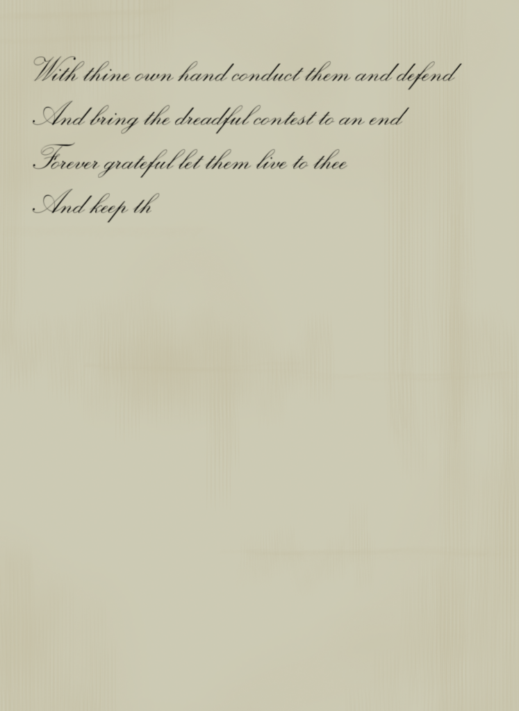
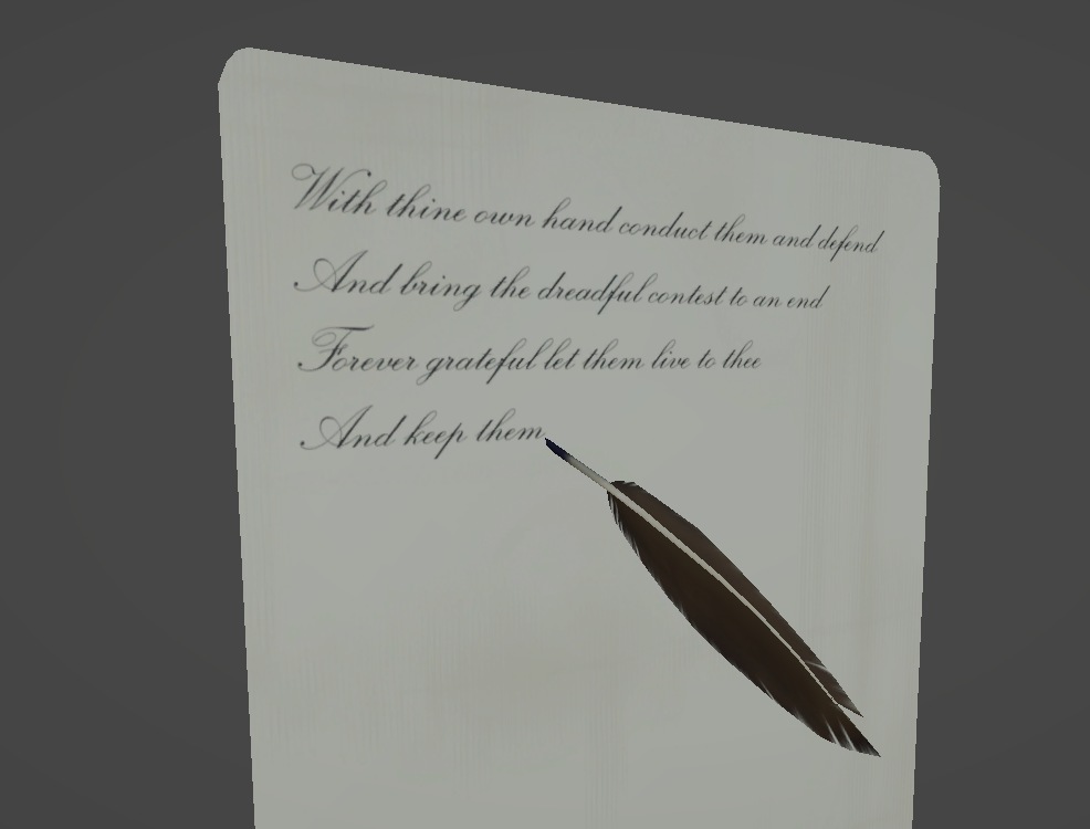
I started with an image of the text as we wanted it to appear on the page. Then I traced the text roughly using Blender’s grease pencil tool, set the grease pencil lines to appear gradually, and timed them with the sound clip. That allowed me to use the traced letters as an image mask to make the text in the image appear over time. I then composited in some parchment texture and rendered the whole thing out as a video.
The poem text image, the trace, and the combined image
I also created a simple parchment model that the video could be mapped onto.
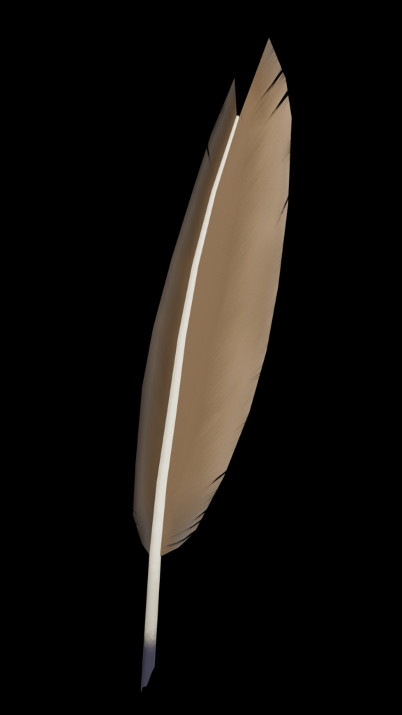
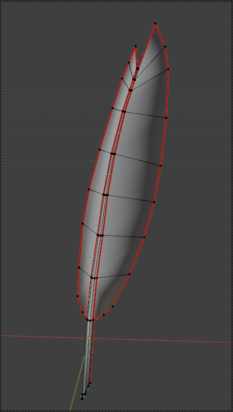
After that, I built a quill pen model and used the traced lines as an approximate path for it to follow. I also gave the quill some extra movement to make it look natural, as though someone was writing with it. Because I used the same track I had used to create the text video, the quill’s animation would line up correctly with the text when brought into Unity.
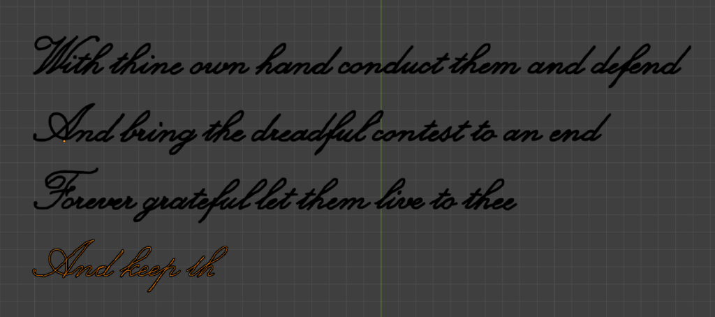
The quill pen modelThe page and quill in Unity, midway through the text
My Role: 3D modeling, animation and rendering for room-scale projection, visualization
This work was part of a Winter Light Festival project with eTribe. The project was initially slated for the 2026 festival but was eventually postponed until 2027.
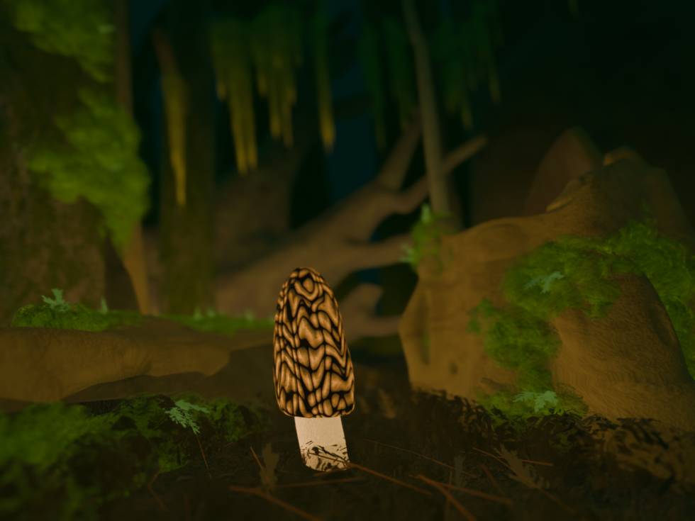
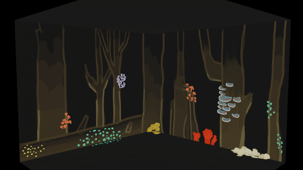
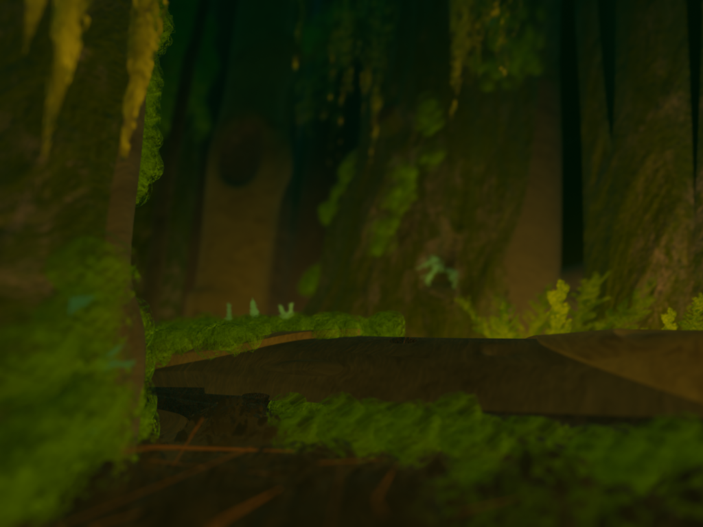
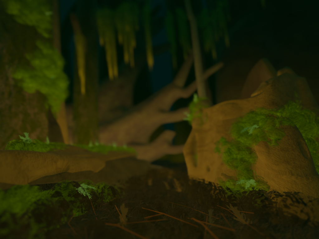
The project will be room-scale and will allow visitors to interact with projected images by moving around the room. Depending on their interactions, mushrooms will “grow” on the walls as projections, gradually filling the space.
All of the code and technical aspects for the interactions (as well as some associated particle effects) were handled by the rest of the team, as was the installation of the projectors and sensors. My focus was entirely on the imagery and animations for the wall projections.
The Setup
As soon as I knew the approximate dimensions of the room we would be using, I created a mockup of the walls and the projections in Blender. This allowed me to experiment with the look and feel of the projections without the projectors being set up in the physical space. It also allowed me to get feedback from the team without other team members needing to be in the space.
I began with some simple sketches. Did we want simple giant mushrooms on a dark background, or did we want a forest scene to contextualize them?
During this phase, I also did research on some visually interesting types of mushrooms that are native to the PNW region and ran a poll in the team Discord channel to determine everyone’s favorite fungi candidates.
We ended up settling on the forest scene. My next step was to get the scene mocked up in Blender so I could start experimenting with lighting and color.
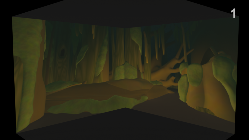
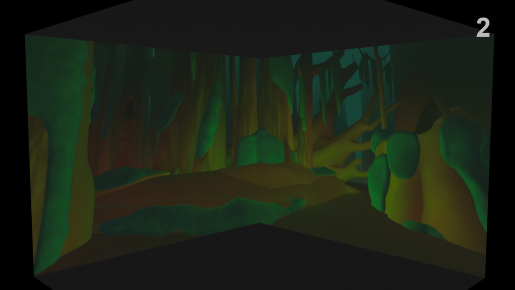
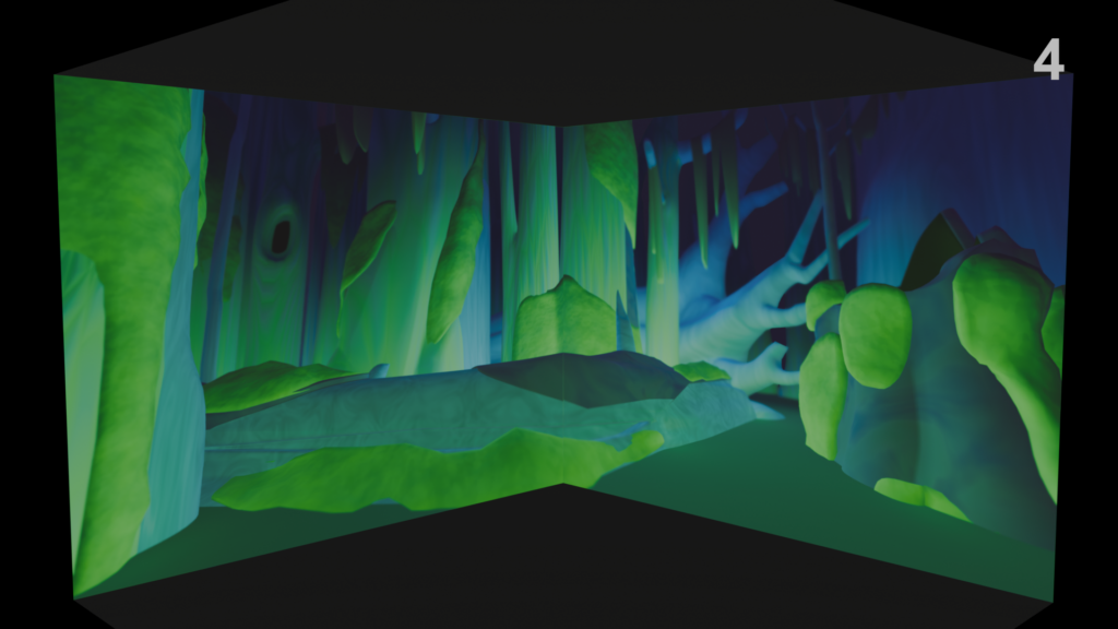
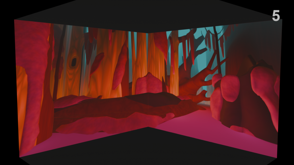
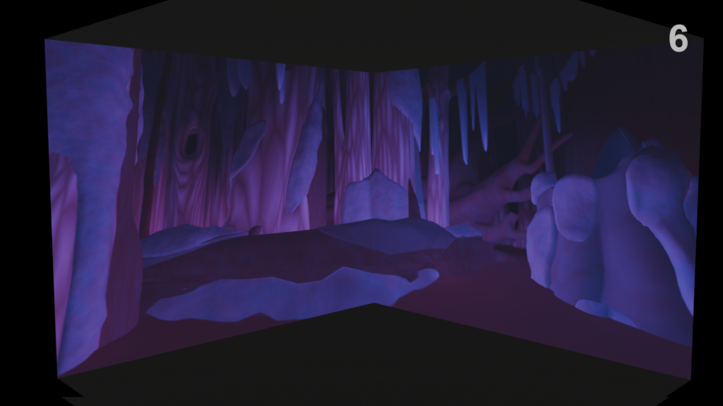
Once I had a simple scene setup, I could quickly iterate on lighting schemes and material colors to create different atmospheres.
I also needed to set up the scene to render in a way that would look correct when projected. We wanted the camera to angle upwards slightly; this, plus the depth of field, would make the viewer feel like they were very small and near the ground level. To account for this, the rendered images had to be slightly warped to make them line up properly where the walls met.
The Scene
Once a color scheme had been selected, I added detail to the scene.
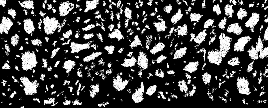
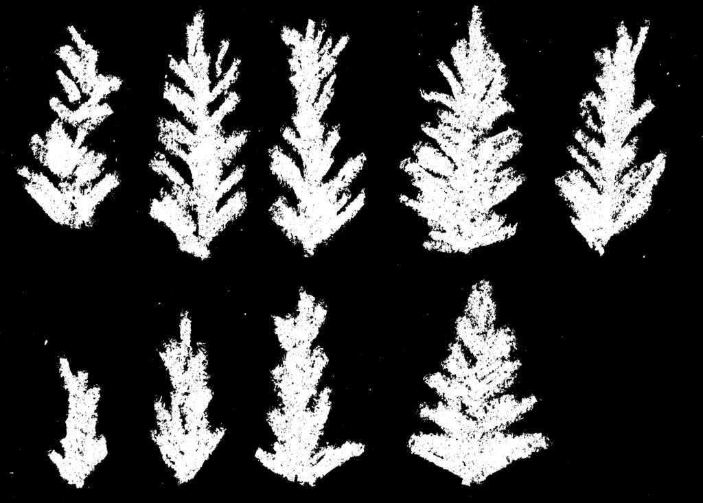
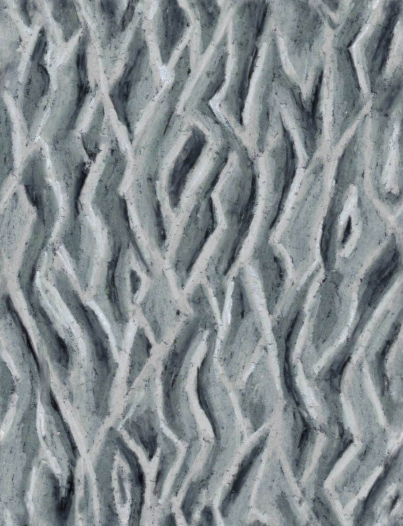
To make it reflect the forests of the Pacific Northwest, I knew I’d need to give the scene some serious texture. I did this by using physical media to draw swatches of texture and small, foliage-like shapes. I then scanned these images, turned them grayscale, and set them up to tile seamlessly where needed.
These become transparency maps, height maps, and additions to color maps in the materials of the forest scene.
The Mushrooms
The mushroom models needed to be the visual focus of the projections. We had specifically selected brightly-colored, visually interesting varieties so it would feel rewarding when visitors to the experience cause them to appear. I gave each mushroom type its own unique growth animation and set them up such that they could be placed anywhere in the scene.
My role: environment art, 3D modeling, texturing, and realtime VFX
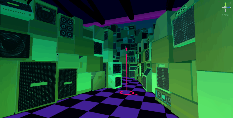
Being an environment artist on LOVESICK was a delightful and challenging experience. I was lucky enough to get to work off of concept art from the creative director/2D artist, which defined both the general look of each area of the game and the bold colorscapes. Filling in the details of a lot of the virtual spaces and objects was my job. I worked alongside a fellow environment artist, a character artist, the 2D artist, and many other talented folks. Two things provided the unique constraints in which I was creating models:
1) The limitations of building out large environments without overwhelming the processing power of a VR headset
2) The stylized cel shader that was applied near-universally throughout the game.
The cel shader created bold, flat colors and overarching gradients across scenes.
Challenge #1: Stylized But Legible
The cel shader defined the game’s aesthetic and allowed a lot of broad control over the colors, but it risked making objects look visually flat if I didn’t set the models up in a way that made them read clearly.
In some places, that meant adding highlights, lowlights, and small details to define the contours of objects. In other places that meant using patterning or decals to provide contrast and a sense of distance.
Contour highlighting and definition.Using patterning and color variation to create depth and readability.
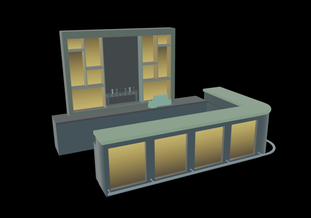
In other cases, it meant using a pseudo light map to paint an object to look like it was illuminated without there being an actual light source! (Light sources are very processor intensive in a game engine, so any opportunity to avoid using one is a good opportunity.) Our lead developer adapted the shader to make this approach work efficiently.
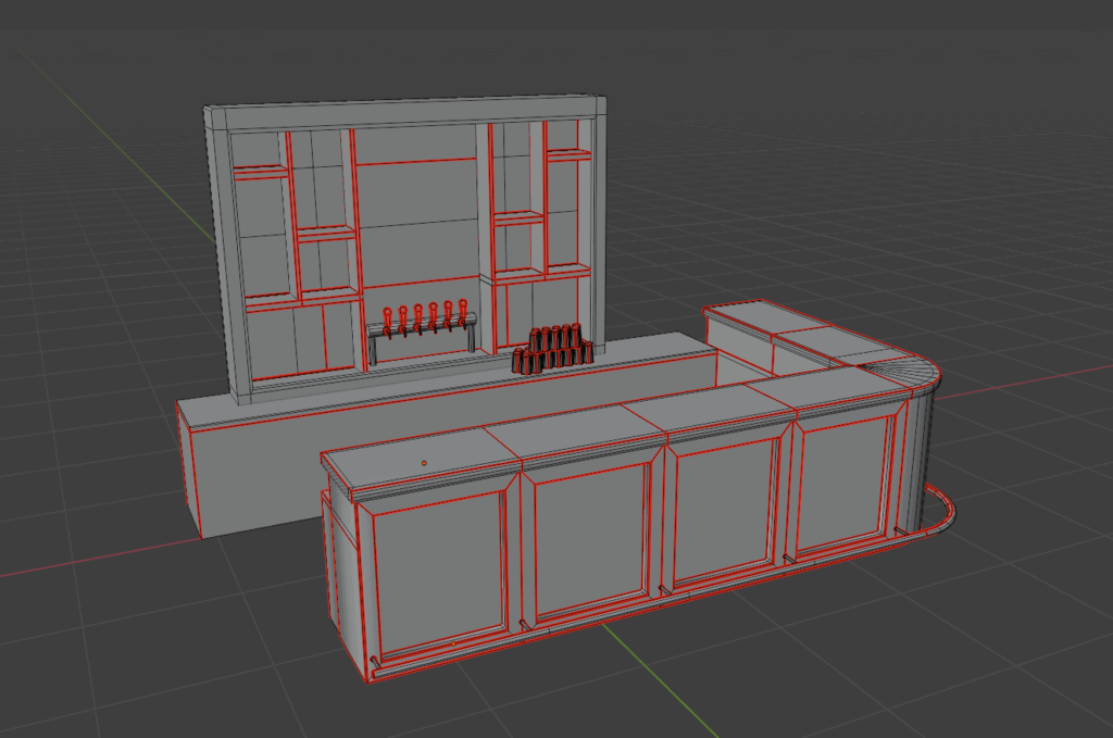
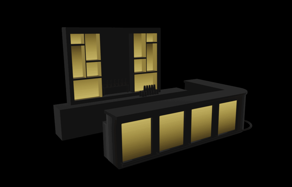
Bar model mesh, emit map, and full color.The bar as it looks in Unity.
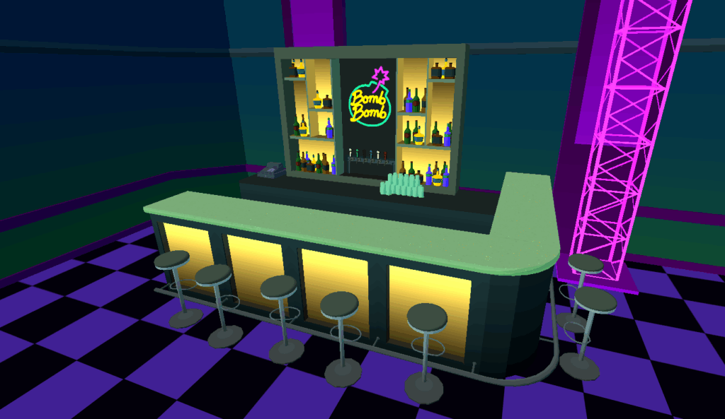
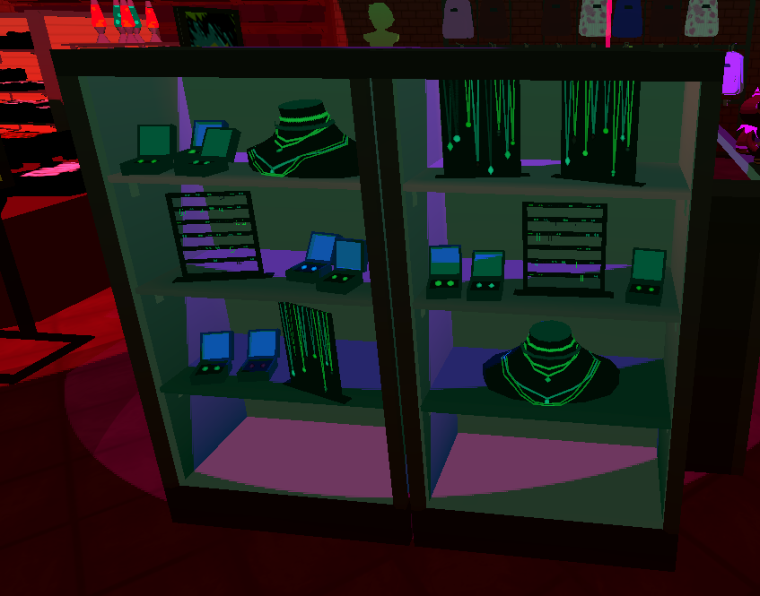
I also learned from the dev team that partially-transparent materials are very processor intensive, so we wanted to avoid those as well — to be efficient, things needed to be either fully opaque, or completely invisible. One of my particular favorite effects in this project was making “glass” display cases that fool the eye into thinking that there is semi-transparent glass, when there actually isn’t anything there. I did this by tinting everything inside the case slightly blue-green. When the color shift ends at a specific line, the viewer assumes that that’s where the glass is!
Modeling with minimal polygons was required for this project, since the game spaces were often quite busy and had a lot of small objects in them. But the director also wanted to avoid things looking too blocky. Getting the greatest possible visual mileage out of simple graphics was central to the project.
New polygons are added only where they’re needed to define details.
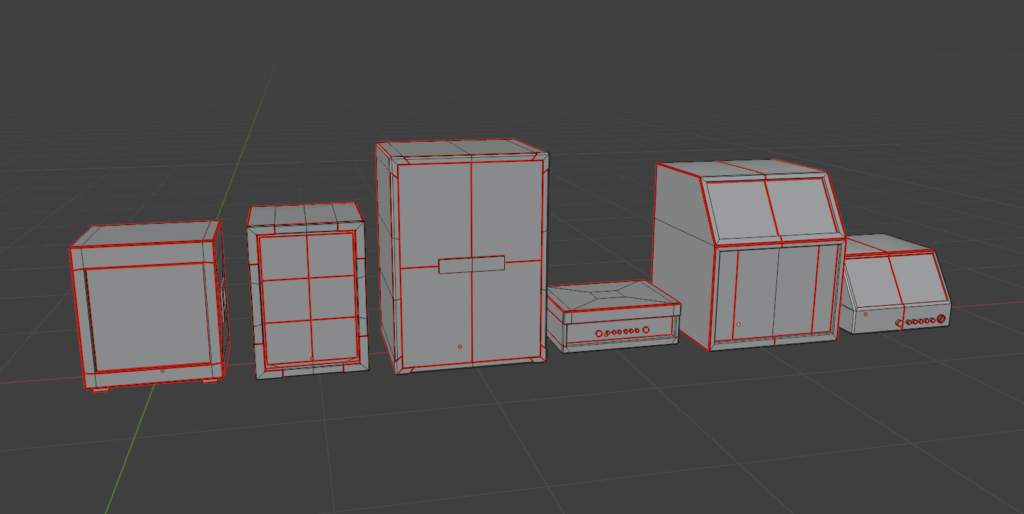
Unity engine can be made to process multiple objects as though they were one, provided they all have the same material, which increases efficiency and frame rate. In order to have the same material, they need to share the same texture map(s). With a little creativity, a whole lot of objects can be mapped onto one texture map — in fact, in some areas, a whole room might use only a small handful of materials, while each object still looks unique. This technique also makes it easier to do large-scale adjustments to the color scheme, since only a few materials need to be modified.
A wall and a display case filled with arcade goodies, all using one texture map. Decals are stacked, 2D graphics (provided by our 2D artist) are applied repeatedly.
Some shapes, particularly repeating ones, can also be made using clipping maps, which make parts of an object visible and others invisible. I made use of this for things like scaffolding or plants, which does a lot to keep the models low-poly.
Clipping maps adding detail.
Process thoughts: The Spatial World
VR adds a new dimension to design — literally. I often find that viewing an asset on-screen while building it and viewing it in VR are very different experiences.
Even after working in VR for some years, it sometimes challenges my expectations. It makes me rethink size, color, brightness, and detail levels. Everything that is done in the 3D modeling software is amplified by the immersive nature of VR. Relative scale and space become vital, and even small animations become an injection of life into a digital world.
Sometimes the best approach is just to iterate – try something that seems about right, spend a little time with it in the headset, and then adjust, and repeat as needed.
More About the Game
You can read more about LOVESICK on the Rose City Games website here And check out the official release trailer!
This is a passion project which is still in development. It’s a mobile AR app which visualizes the huge sheets of ice which covered the landscape in the ice ages. It’s intended for use at scenic overlooks amid the dramatic landscapes of the Pacific Northwest.
The app is built in Unity and uses pre-loaded terrain models that I downloaded into Blender via the BlenderGIS addon. The user orients the terrain models to match the real-world landscape. Then a virtual layer of ice is placed at a specified height, where the digital terrain masks it out, creating an overlay on the real world.
The technical setup, where the pre-loaded scan is overlaid on the real world, was based on the system I initially put together for the Escape Room Ghost — it’s an AR experience tailored for a particular place. In this case, that place is a local scenic overlook.
This app is a work in progress, but here’s a demonstration of its current state.
This project is a little different from other space-based work I’ve done, in that the space is outdoors and is much larger than mobile AR is generally used for.
Challenge #1: How do I get terrain data?
3D terrain data for most of the world is pretty easy to access. However, loading enough of it to cover a visible region gets dicey; it’s too much data to reasonably download for any given area you’re in.
I realized pretty quickly that having on-the-fly downloading wouldn’t make much sense anyway — the app could really only function at specific locations. In order to see how the ice would have appeared on a landscape, you need to be at a high vantage point. And because there’s no unified data set on ice depth, there would be lots of areas where there’s no information available about the ice. So while universal usability tends to be the default in app design, this app pretty clearly called for individual, site-specific experiences.
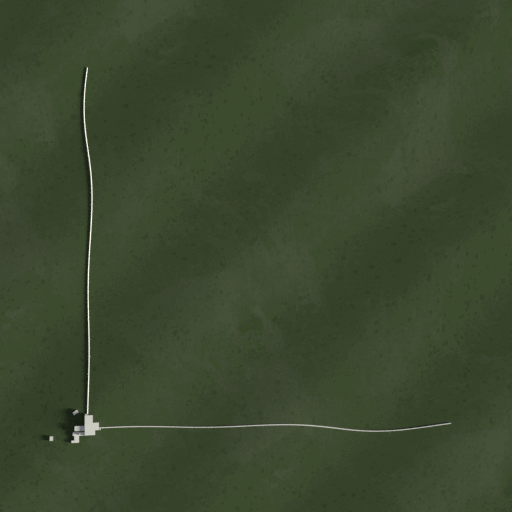
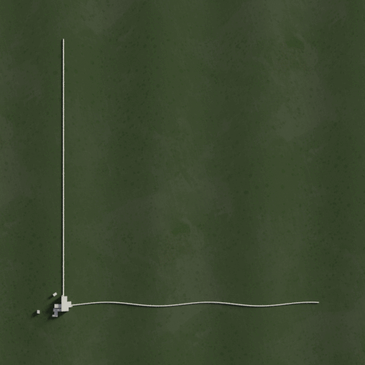
Making the app site-specific and creating custom scenes for each chosen location also meant that the app could function fully offline, with the virtual terrain for each site built into the app. This made it possible for me to curate what virtual terrain I really needed: I downloaded a large square of map terrain for the first example site, but then cut away all the parts that wouldn’t be visible. This shrank the 3D file down considerably and allowed it to load more easily.
The modified graphical terrain tile in Unity.
Challenge #2: How does the app know where the real world is?
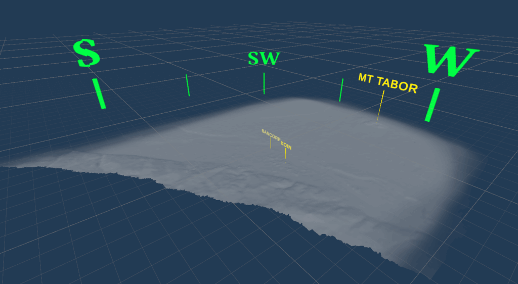
To get the virtual landscape to line up with the physical one, the app needs to know pretty precisely where things are geographically. This could be done using points of reference, but the changing seasons and lighting of the natural world, combined with the small visual size of most of the available landmarks, means that it would be very difficult to get the app to identify specific reference points. For example, getting the camera to identify the location of the Bancorp tower in downtown Portland would be nearly impossible, although it’s easy for a human. A phone’s location data can tell the approximate direction that the camera is being pointed, which could help, but it doesn’t have nearly enough precision for what we need to do here.
All of this means that the user needs to help the app figure out where some real-world points of reference are by doing a quick calibration. This is shown in the video above.
Next Steps
My next steps for this project will probably be refining the graphics, since they’re currently in a mock-up stage. I’m intending to get some building data so that the ice can be masked out by taller buildings as well as by the natural landscape. I’d also like to gather more data on the real-world depth of the ice age glaciers at different times and make that available to the user at each site.
I’ll post updates on this project as it continues!
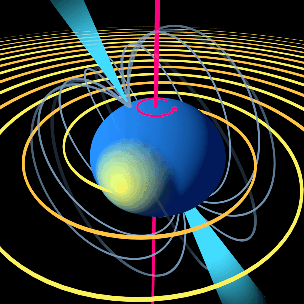
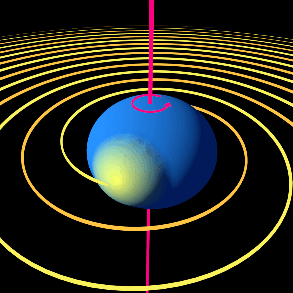
These gifs came from a conversation with my sibling Ansel, who works with the LIGO collaboration and also teaches undergraduate physics. They were dissatisfied with the diagrams that were generally available when teaching students about spinning neutron stars that generate gravitational waves. The existing diagram they had been using illustrated several pieces of important information:
A neutron star is spherical and spins around its axis
It can be “squished” along its rotational axis, but that distortion is symmetrical around the spin axis, so it doesn’t create gravitational waves.
If the star has a bump or some other distortion (sometimes called a mountain) which is NOT symmetrical around the spin axis, that causes gravitational waves to be generated as the star spins.
But the diagram also had some shortcomings:
It didn’t clearly portray the way that the waves move out from their source
It didn’t give a good sense of the “mountain” being an asymmetrical piece of the star
It was a still image, where including movement would have provided much more info to the viewer.
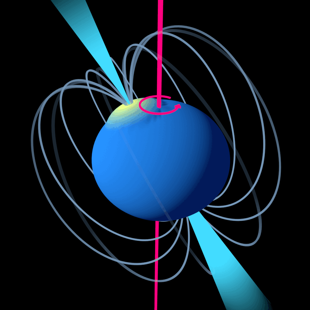
It also didn’t portray some potentially helpful information that was shown in other diagrams, like the star’s magnetic field and the beams of light that they emit from their poles, which also don’t necessarily align with the spin axis.
So I took this as challenge for my animation skills.
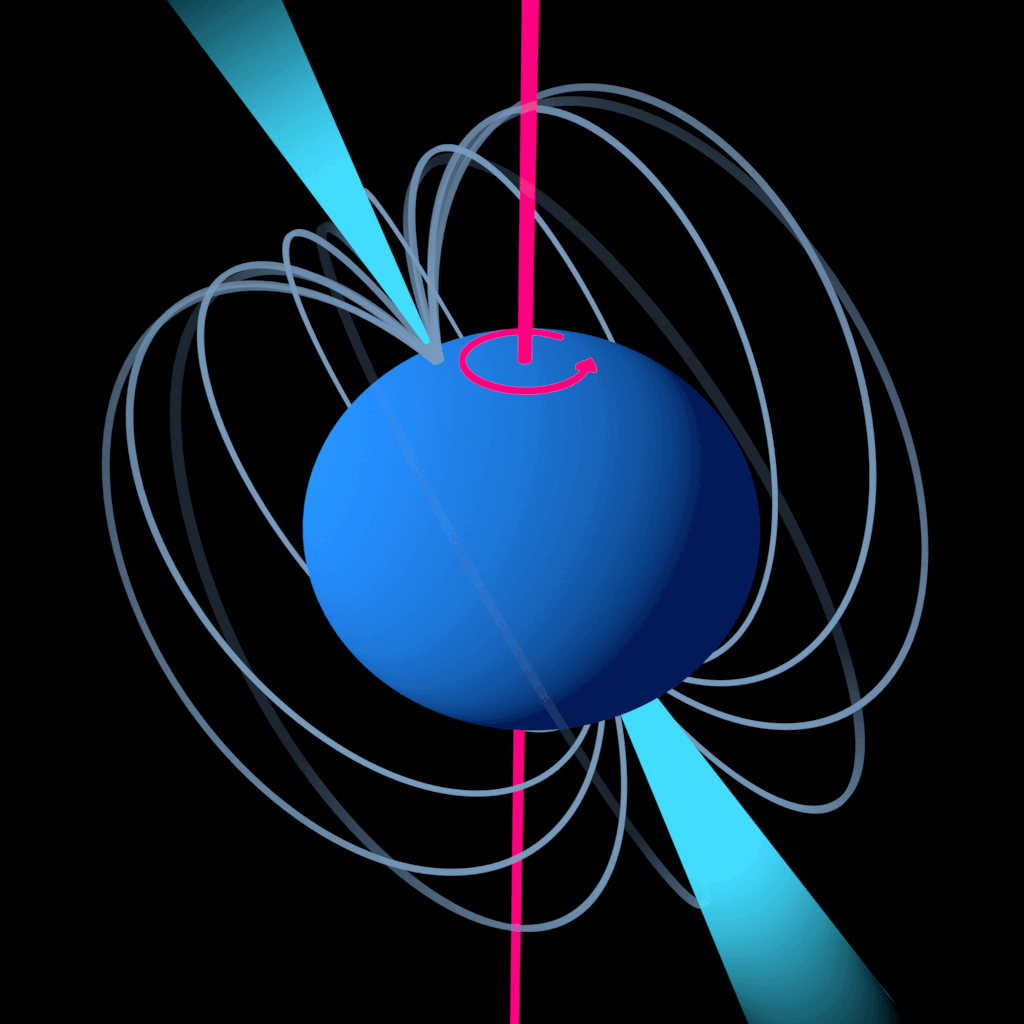
Modular Animations
Star with jets and magnetic field lines onlyStar with “mountain” and wavesCombined animation with jets, magnetic field lines, mountain, and waves
My goals here were:
To use color to differentiate and highlight important elements of the diagram. There is a lot of information at play here, and I didn’t want it to become too visually cluttered to be clear
To use animation to visually describe a moving system in a way that a still image couldn’t
To create variations of the gif that showed different combinations of the same elements, so that Ansel (or any other instructors who wanted to use the images) could choose which one was most useful for what they were teaching.
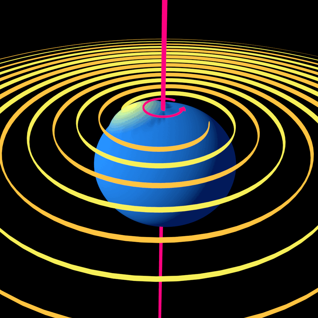
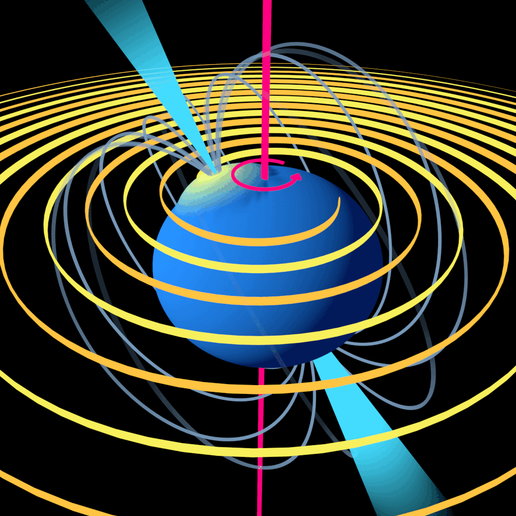
Alternates
Once I had the initial layout, I also created some alternate versions of the gifs with different mountain placement, just to show another possible configuration.
Star with jets and magnetic field lines onlyStar with “mountain” and wavesCombined animation with jets, magnetic field lines, mountain, and waves
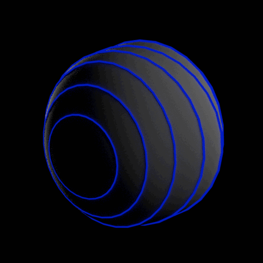
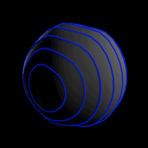
Like the neutron star gifs, this was a personal project based on a conversation with my sibling, who is a physicist. They pointed out that the usual representation of gravitational waves that appears in pop sci publications illustrates how gravitational waves move from their source, but doesn’t clearly show what gravitational waves actually are: distortions in spacetime.
The waves distort spacetime, and all the objects in it, in different ways along different axes. As the waves ripple out and pass through an object, the distortions change cyclically.
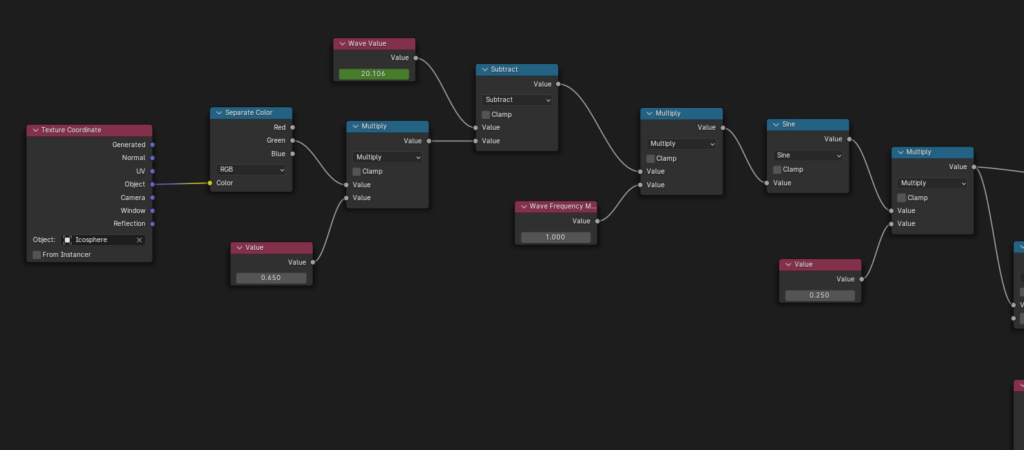
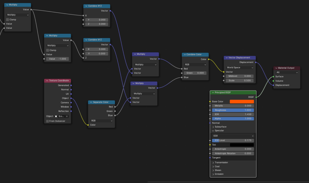
So this shader separates the object’s X, Y and Z axes. In Blender’s case, this means encoding them as the red, green, and blue channels in a color. It then modifies each of them using a sine function and recombines them back into a color that can be used to set the vector displacement value, which controls how the vertices of the object will appear to move. I created accessible variable inputs to control the amplitude, speed, and frequency of the changes.
The shader node network
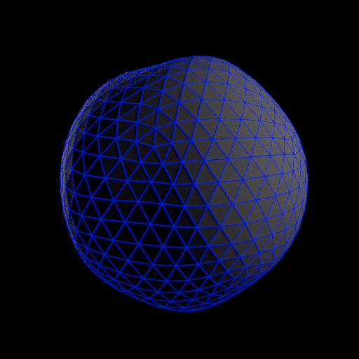
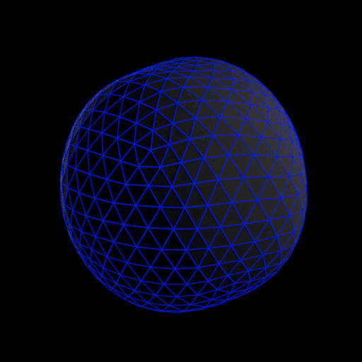
These animations are made at arbitrary scales, and do not show the actual amplitude, speed, or frequency of the waves. The shader is only meant to provide a visual of the kind of distortion the waves create. Actual gravitational wave distortions would be far too small for us to see.
I made the sphere gifs just to provide a variety of visualizations of how the distortions would look. This grid provides a little more of a visual breakdown.
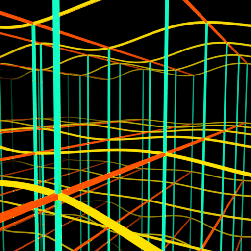
The next set of gifs represents the LIGO Hanford gravitational wave observatory, which measures spacetime distortions in the length of two huge “beam tubes” in the desert of Washington state. The beam tubes are built at 90 degrees to each other so that researchers can pinpoint where gravitational waves are coming from based on the differences in how the tubes are distorted. These gifs aim to provide a simple visual on what those differences look like depending on the direction the wave is coming from.
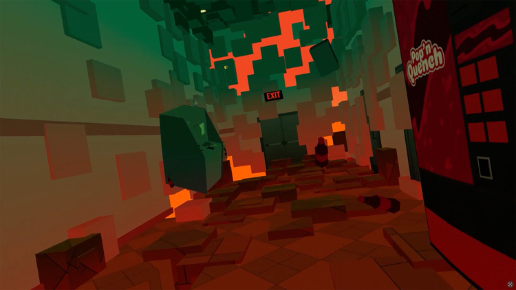
The ghost project is a space-based AR experience that’s part of an escape room. It shows the user a ghostly character who moves around the room that they’re in and provides hints to the escape room puzzles. It was initially a mobile AR app, but was eventually turned into a non-interactive screen-based AR piece.
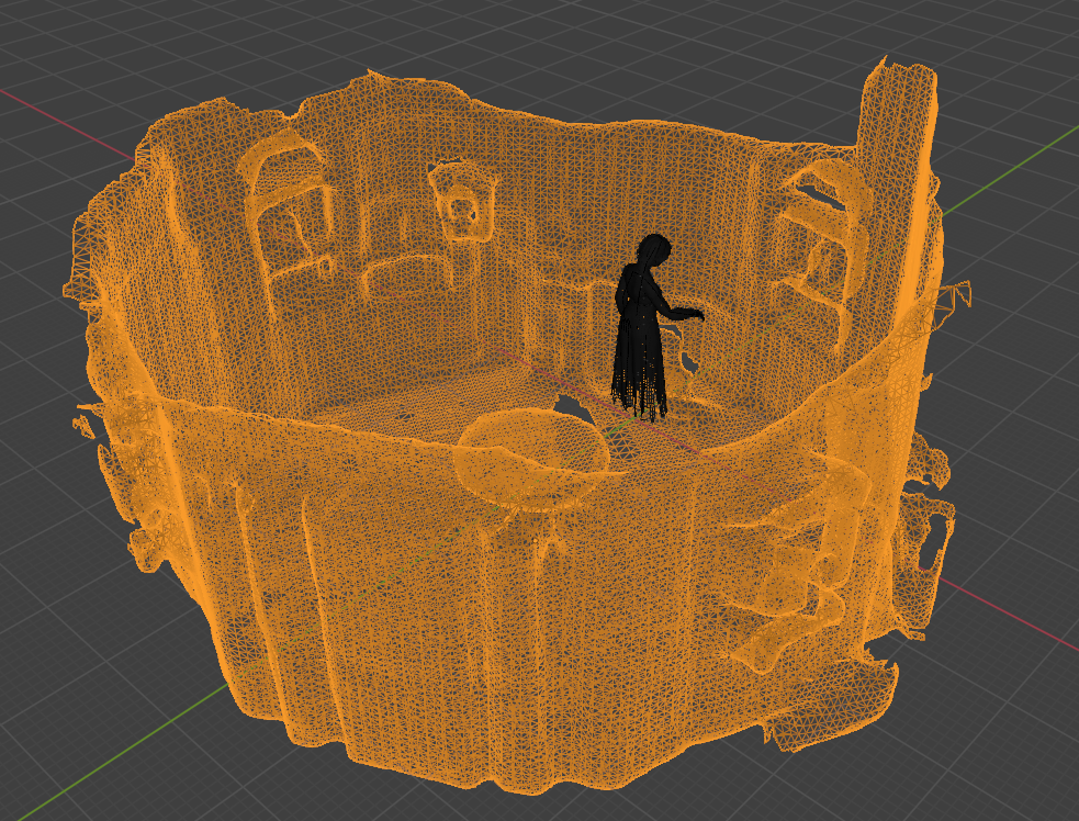
The app is set up before each use by matching a pre-existing 3D scan of the room with the room itself. This is done by pointing the tablet camera around the room space and allowing the app to detect planes, so that the AR elements can remain steady and locked into place. The person doing this calibration (intended to be the escape room attendant) can then rotate and adjust the room scan mesh to match the room. The scan mesh then becomes invisible, but will still occlude the ghost and other AR elements, allowing them to look like they are moving behind or through objects in the room.
The room scan and the ghost model mid-animation, as seen in Blender
Then, while players are in the room, the app detects the presence of cards that the players find and scan. Each of the cards triggers a unique animation in which the ghost appears in a puff of smoke, moves around the room to give the player a hint about the puzzle they are trying to solve, and then vanishes into smoke again.
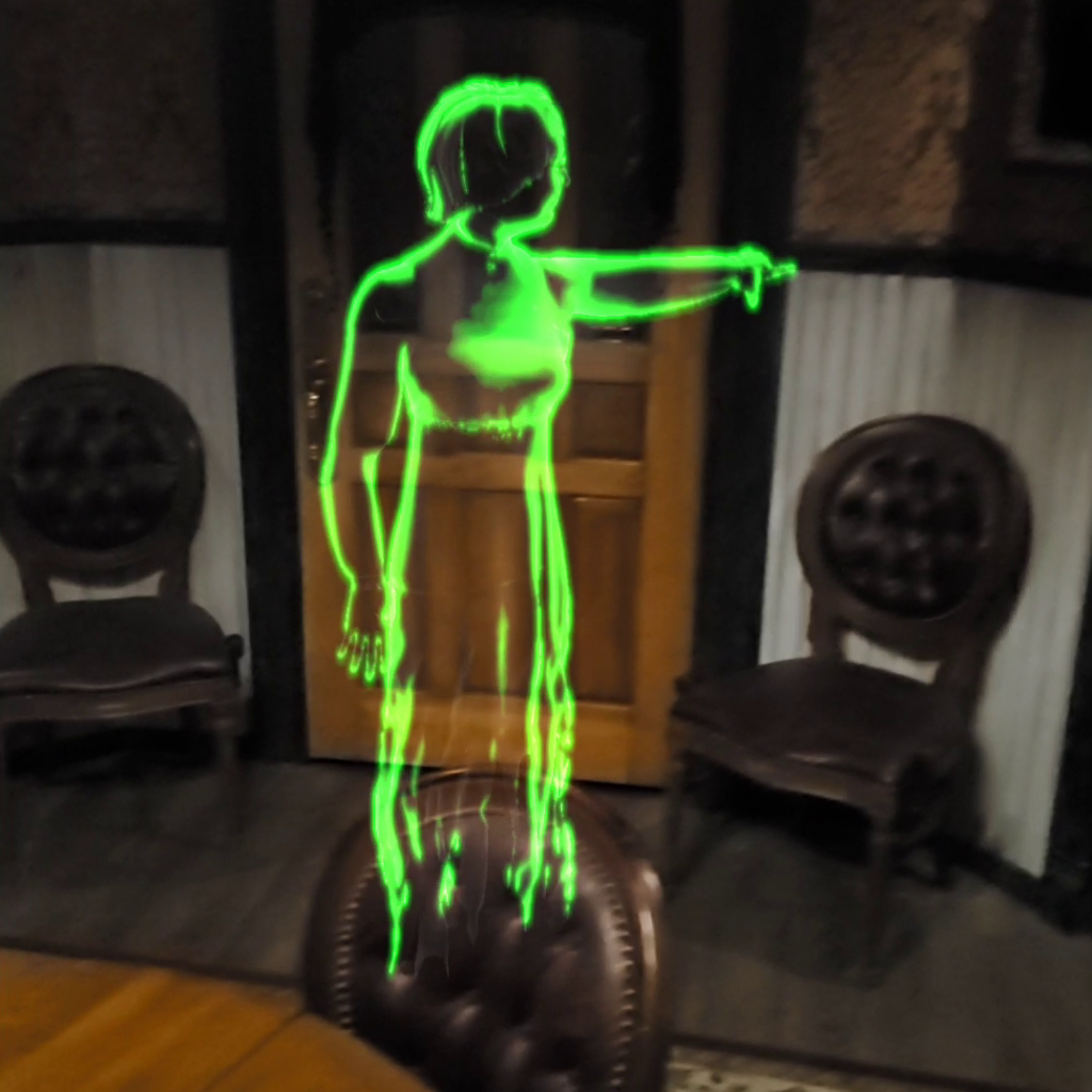
The rigged ghost model was provided to me for this project, and we recorded some mocap clips of an actress as a starting place for the ghost’s animations. My role was to develop the app, combine and modify animation clips (and create new ones as needed) and to create the realtime VFX for the smoke, the glow of the ghost, and the fluttering of her skirt as she moved. I put everything together in Unity engine and built it to work on an Android tablet.
The ghost, with transparency and glow effects applied in Unity
The AR app did not end up being used — user testing showed that mobile AR wasn’t intuitive enough for first-time users. So I modified the project such that the animations could be played on a TV screen, overlaid on camera footage of the room. This way, users could see the ghost glide around the room with them without needing to interact with the device directly. This maintained the AR experience while simplifying the user experience.
For me, it meant modifying the virtual camera’s settings to match with the “security camera” type footage that was being used onscreen, rather than matching up to the tablet’s camera. After that I could just render out the animations as video clips with a dark background, which could then be layered over the live footage.
Created by Sprocketship for Mental Trap Escape Room Games.
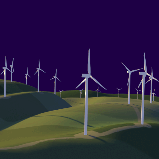
I created these animated gifs just to explore short-format looped animations. All the models and animations were created in Blender. Some were inspired by reading Project Drawdown’s list of existing climate crisis solutions, others were just representations of things I saw around me. They’re intended to be compositionally bold, visually appealing, and maybe a little bit meditative.
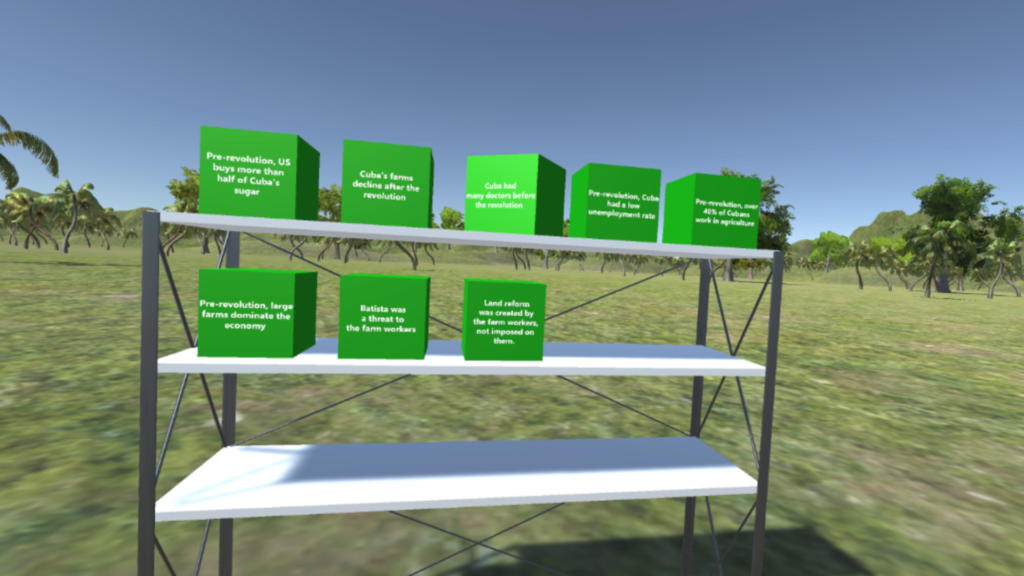
The Thinking Machine project is a VR experience by Shovels and Whiskey in collaboration with University of California Riverside. It’s an educational tool that allows users to interact with information in the form of objects: selecting, moving, and categorizing customizable data “blocks”. It was made as a tool for studying how interacting with VR is different from interacting with information written on a page, and how the physical movement of using VR might affect information retention, etc.
This project was built in Unity engine, and was the first project in which I had ever used Windows Mixed Reality and the Mixed Reality Toolkit, which was fairly new at the time. Since the toolkit was intended for use with either headset VR or for headset AR, it had a lot of differences from previous VR toolkits that I’d used for development.
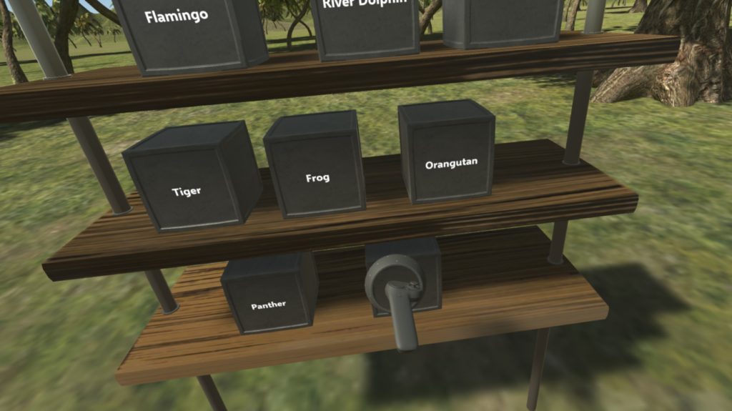
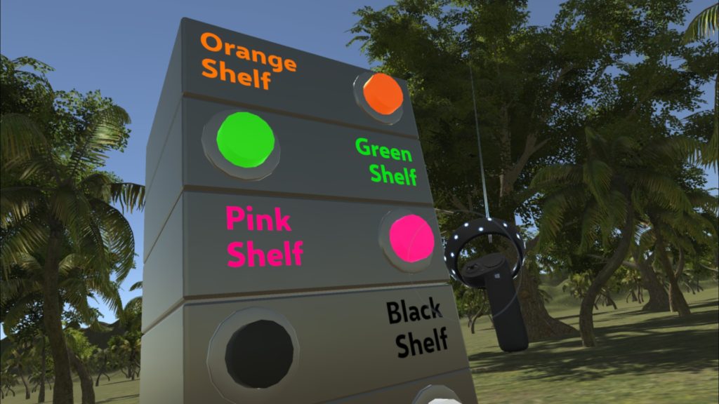
Information blocks are automatically generated and placed on a shelf, based on a text list of inputs.
Text and images can appear dynamically on the blocks as the user completes different sorting exercises.
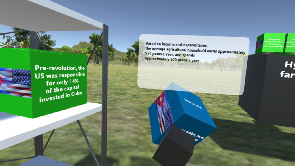
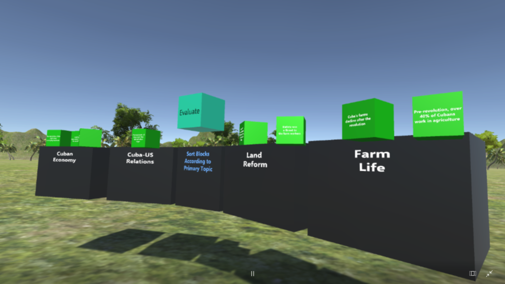
The user moves and sorts the blocks into categories, and their responses are evaluated for correctness before moving on.
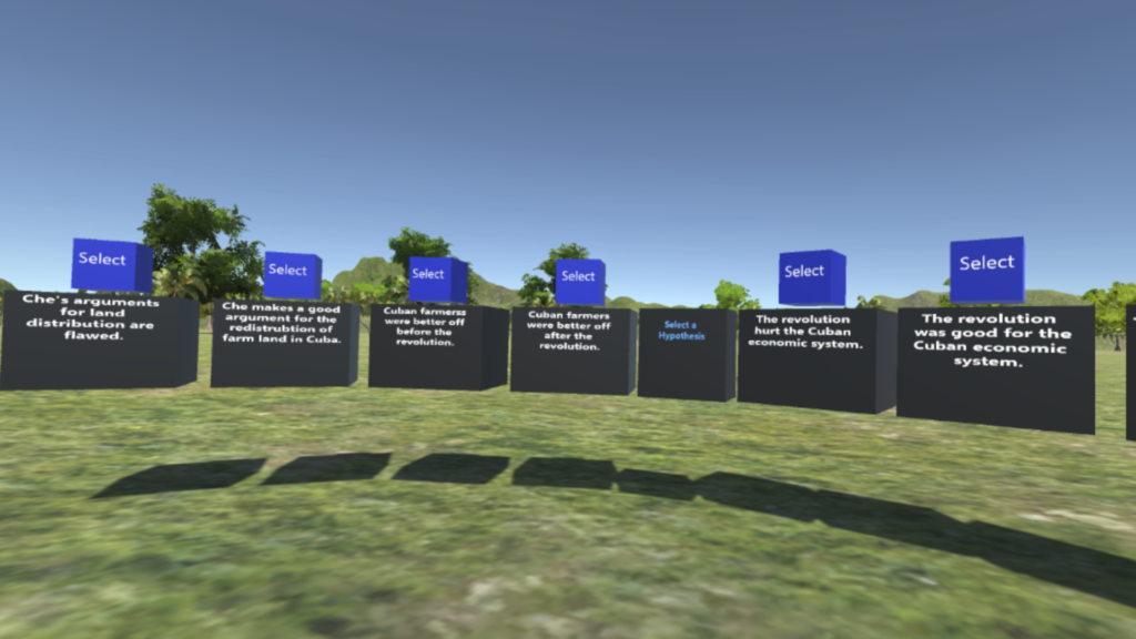
In this exercise, the user selects a hypothesis to defend, which they will then need to support with information from a variety of sources.
This project also has a testing version which was built to explore various methods of interaction. This included different ways of transporting around the scene, and of interacting with objects via the controllers. New users were timed while going through the experience to see which types of interactions they learned the fastest.
Different combinations were then created and tested to see which ones were most intuitive to new or inexperienced VR users.
Object interaction options included clicking the controller trigger once to pick up a block and once to drop it, and a click-and-hold variation.
In this alternative interaction mode, the user moves around the scene by selecting from a panel of buttons, rather than point-and-click teleportation.
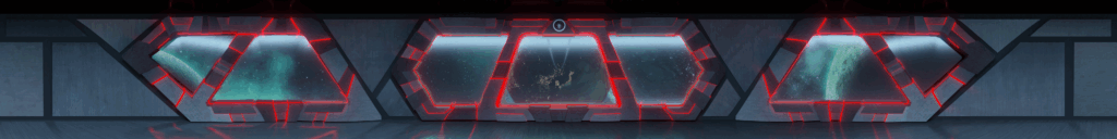
My Role: 3D modeling, lighting, and animation of the spaceship console overlay
This was part of a project done by 360 Labs for Qualcomm / LiveNation. I created, textured and animated the spaceship console in Blender, and then set it up to render such that it would show up correctly on a 360-degree wrap-around projection. 360 Labs could then add it as a dynamic overlay to their video.
I created several different lighting setups to choose from, each with its own unique character.
I set the model up in separate pieces, which could be animated to slide together and apart during transitions in the video.
This video (from Snapdragon Sound’s Youtube channel) shows clips of the projection in action!
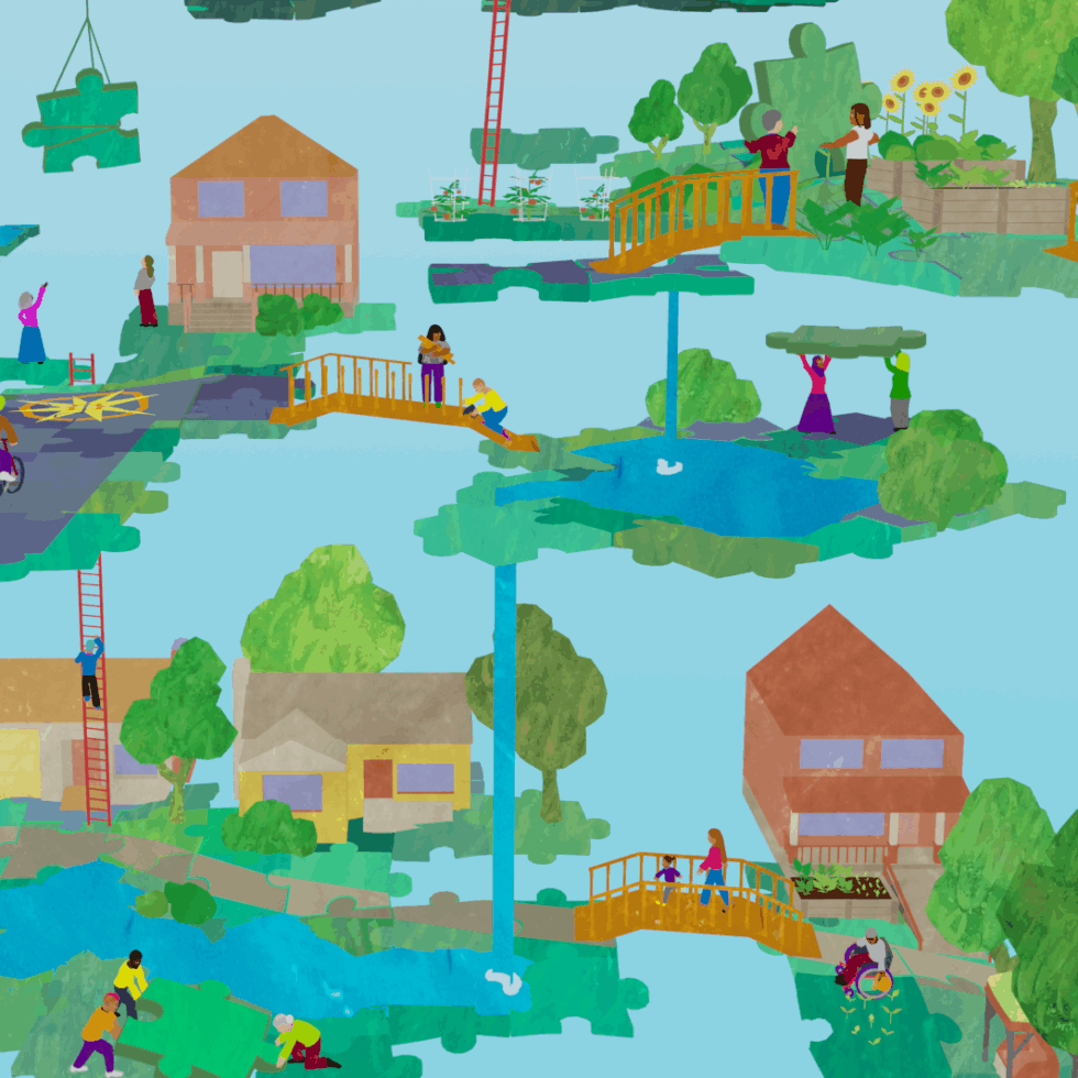
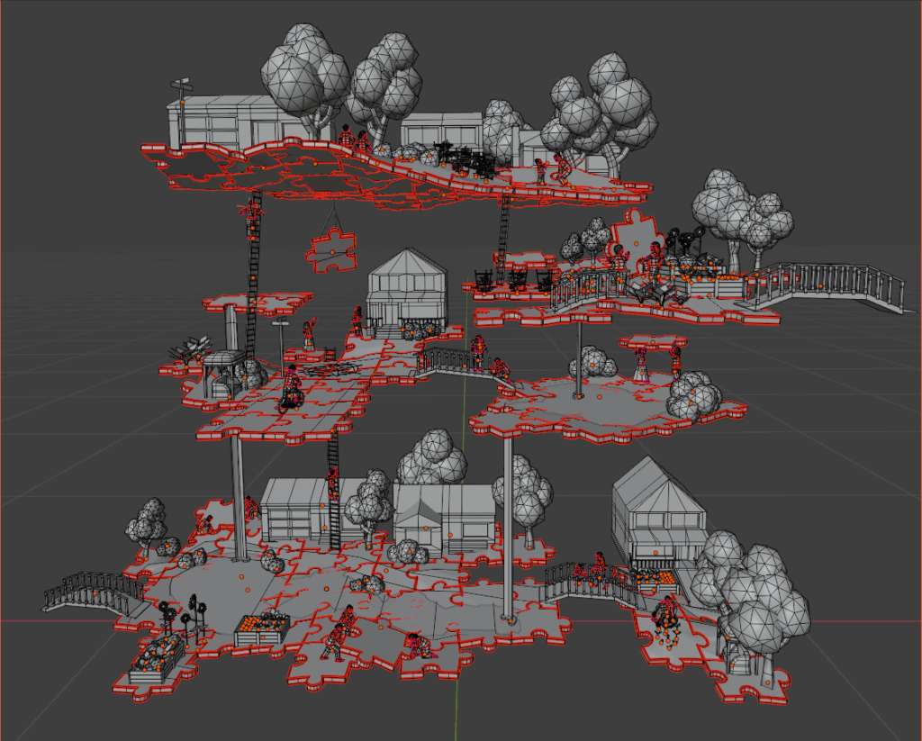
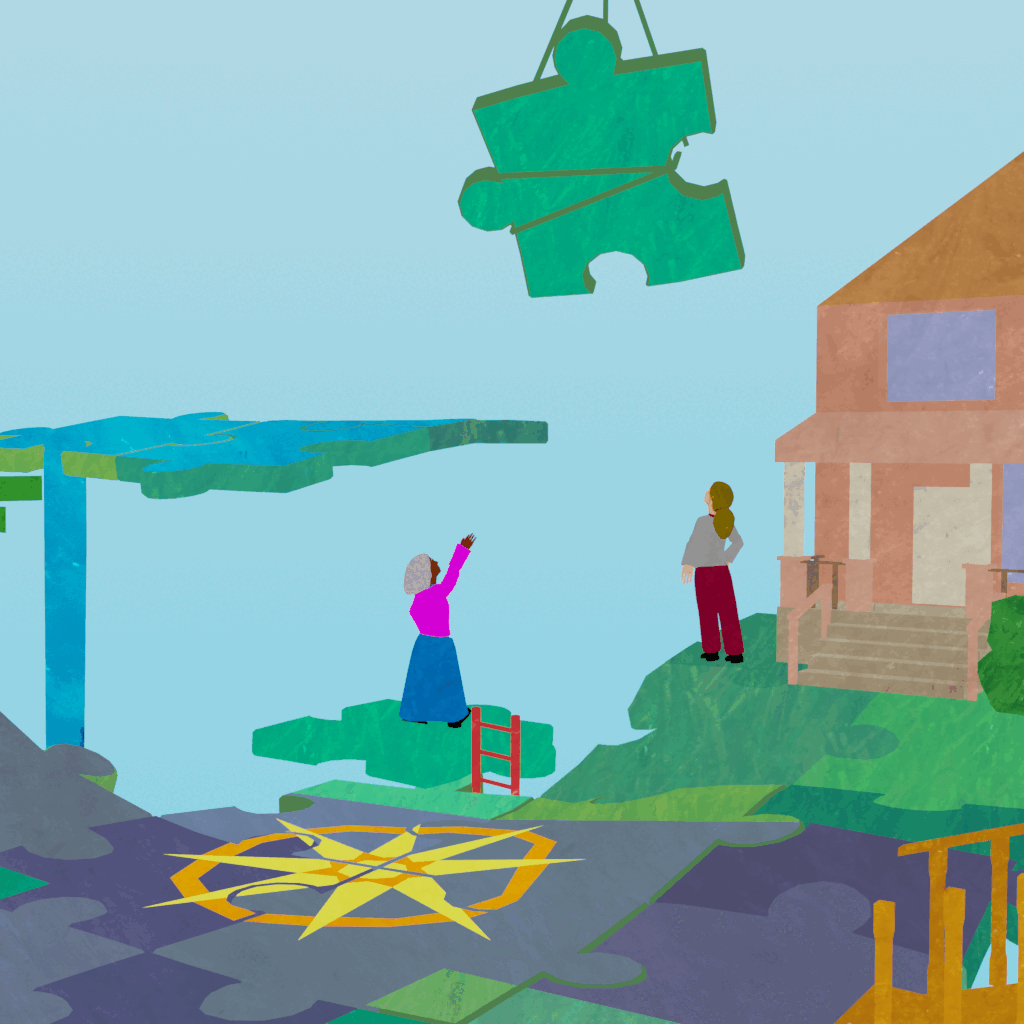
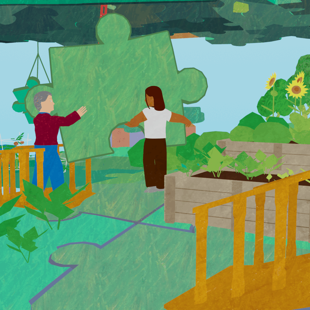
A poster graphic made as a volunteer project for City Repair‘s 2025 Village Building Convergence event.
The organizers requested a poster graphic that showed people building the world they wanted to create out of puzzle pieces. The goal was for it to evoke themes of community, inter-generational connection, co-building of spaces and futures, and connection to nature.
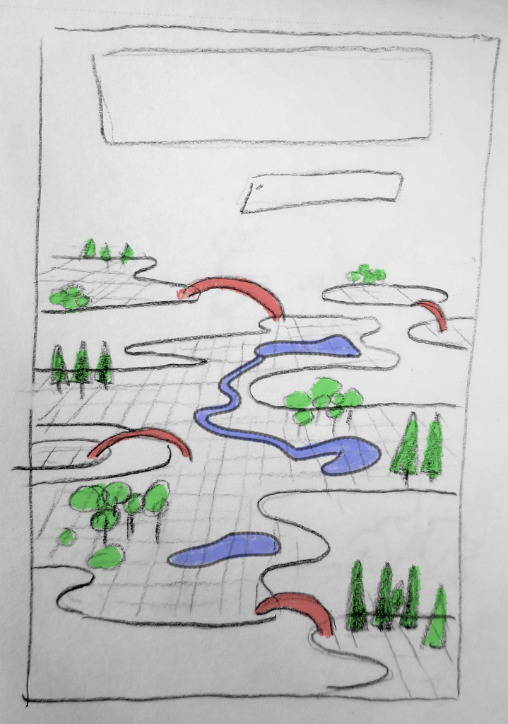
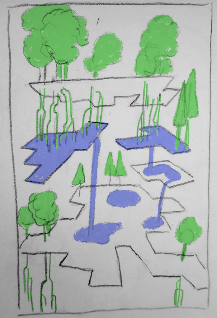
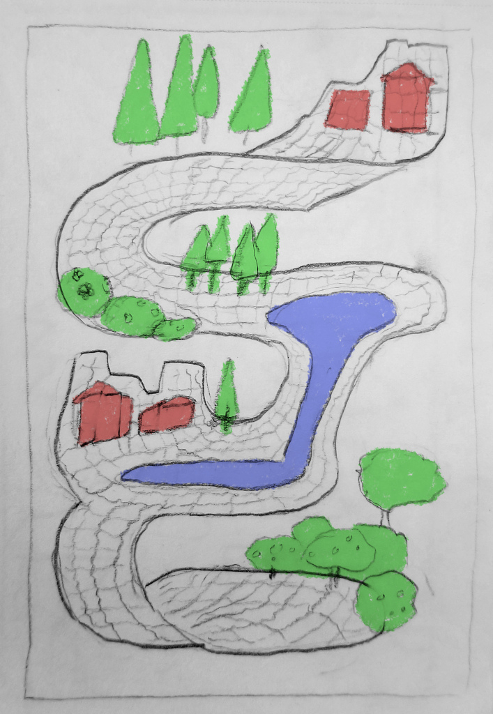
Initial layout sketchesThe models
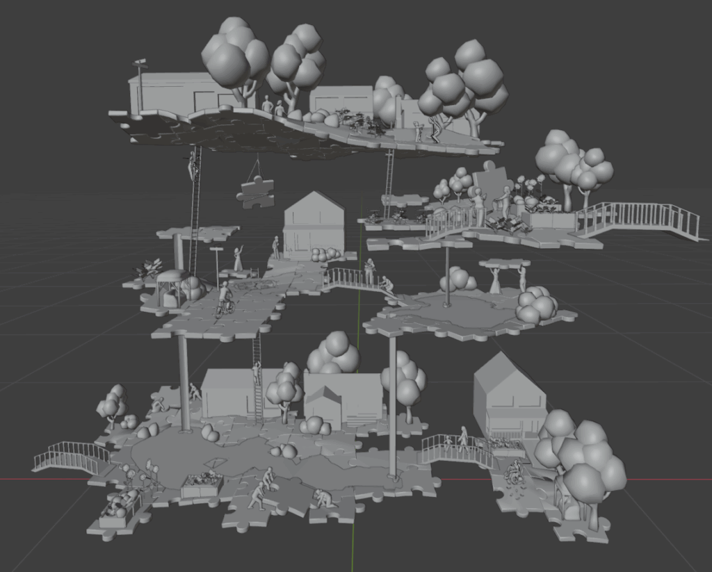
After some iteration and sketching, I built the puzzle-piece world in Blender, but used non-directional ambient lighting and projected textures to create a flat, illustrative style similar to a cut paper collage. This 3d illustration approach allows for easy editing and quick iteration on a design — parts of a scene can be moved, rotated, and copied as 3d objects, and cameras can be placed in different areas for different perspectives.
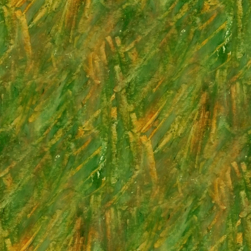
To keep it looking organic and hand-made, I drew texture swatches on paper using oil pastels, photographed them, and made them into tiling texture maps. I added these to the digital materials as flat projections to create the cut-paper look.
Some tiling textures based on pastel swatchesBlender shader graph using a projected texture and a color atlas
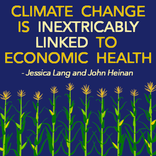
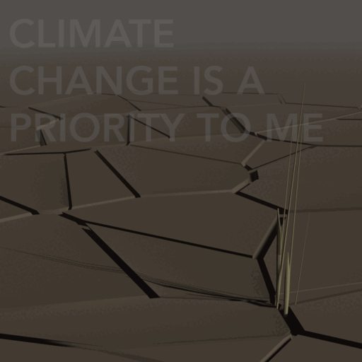
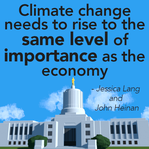
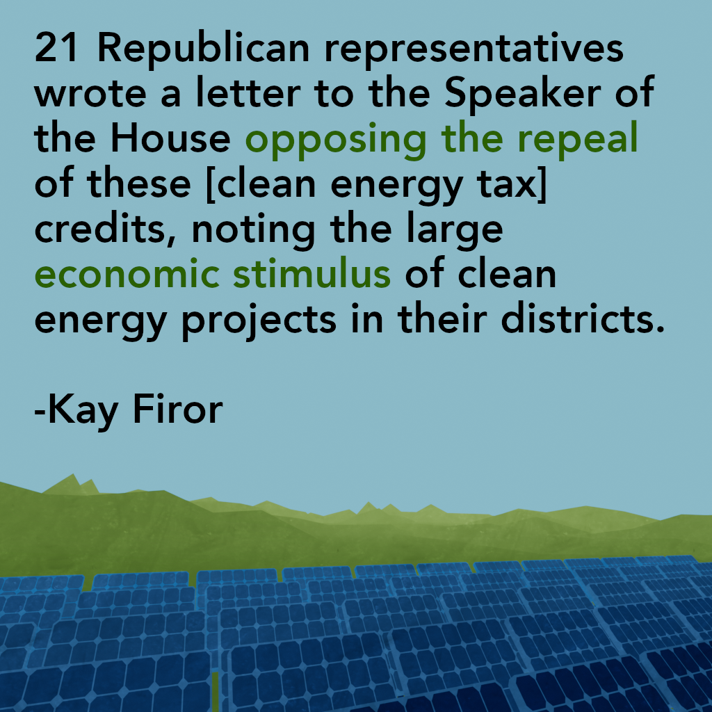
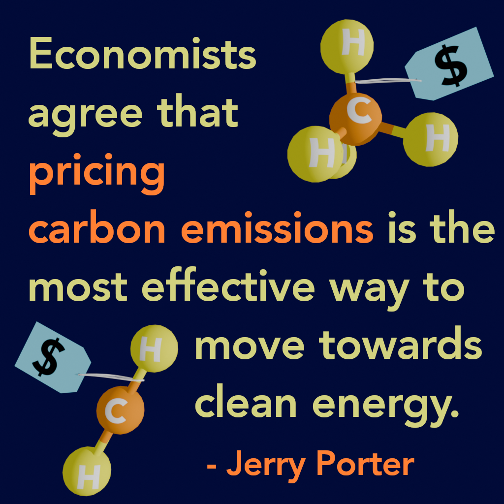
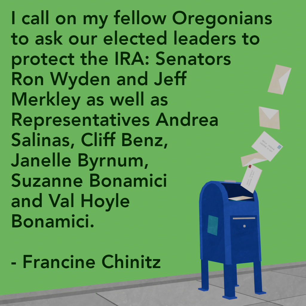
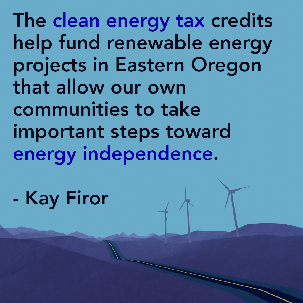
These animated gifs and still images were created as a volunteer project for the Portland chapter of the Citizens’ Climate Lobby, using quotes from op-eds and letters-to-the-editor submitted by CCL members.
These are quick-turnaround images, made for use on social media as an eye-catching and fun way to amplify the voices of the writers.
My role: Conversion of 2D designs to 3D assets, rigging, animation, and some design work.
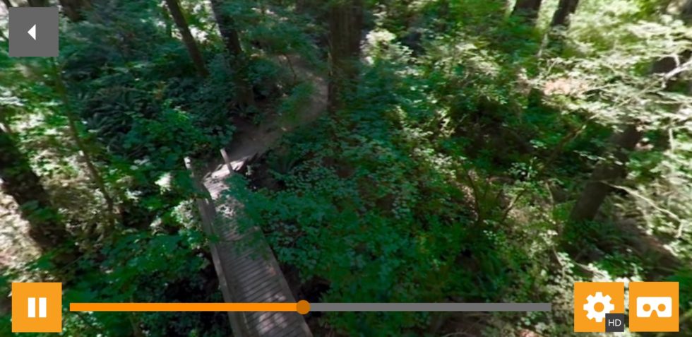
I worked with Platform VR to create a series of 3D interface elements for University of Oregon’s virtual reality tour app, UO360.
The app was built for Google Cardboard and provides new and potential students with a chance to explore campus through 360 videos and images. Given the constraints of the Cardboard, the UI elements and their animations needed to be simple and clean, yet communicative and engaging for the user.
Some of these designs were provided as flat designs, which I converted into 3D assets, rigged and animated — others I designed based on University’s style guide.
360 Image, 360 Video, and Flat Video icons (my designs):
This app was created to showcase the incredible work of 360 Labs. Designed to be easily customized and extended, it draws videos and related content from Vimeo and allows the user to explore featured 360 films and learn more about the company. Users can look around the videos by turning their device or by swiping to rotate the view, and can download content to their device for offline access. The app also has a VR viewing mode for use with Cardboard headsets.
The Menu, Video Landing and About Page views of the app.The 360 video interface in action, including Cardboard mode.